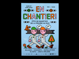
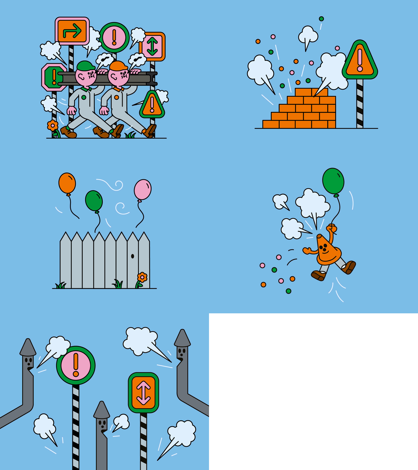
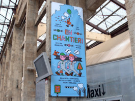
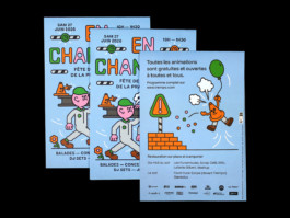
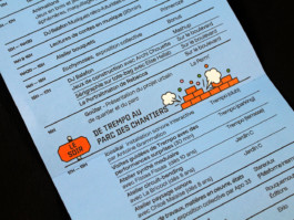
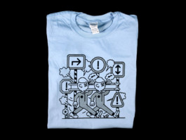
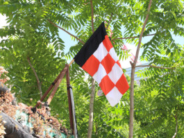
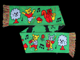
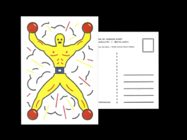
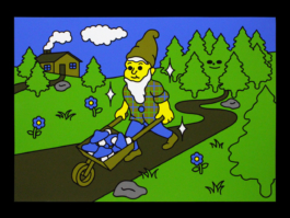
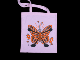
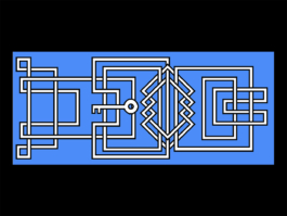
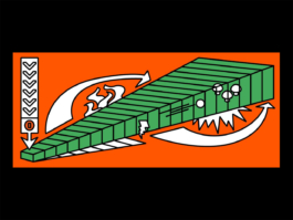
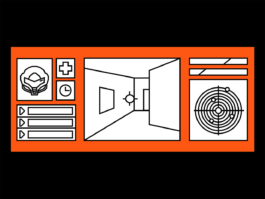
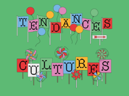
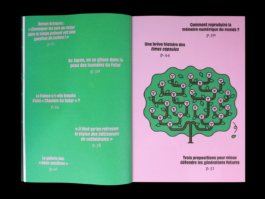
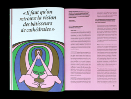
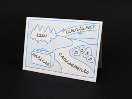
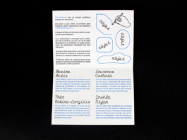
Illustrative visual identity for the Prairie au Duc neighborhood festival in Nantes, based on a construction site theme, bringing together the neighborhood’s various cultural and community organizations and venues.
Typography — Baste A by Lift Type and Apfel Grotezk by Collletttivo
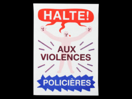
Screenprint — Élise Hallab


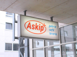
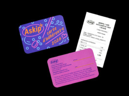
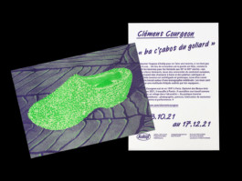
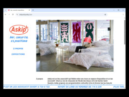
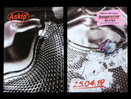
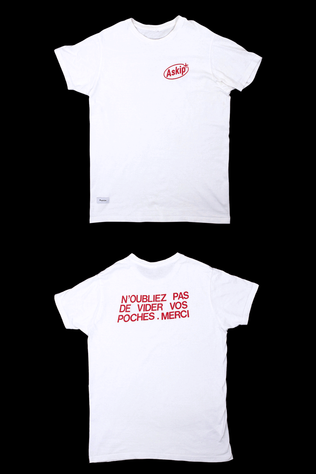
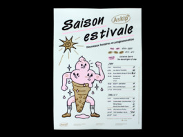
Askip is an art gallery, café, and laundromat located within the Nantes School of Fine Arts. The identity and website is built around Van Dijk, a distinctive typeface that reflects the spontaneity and informal spirit of a community-run café.
website — askipaskipaskip.com
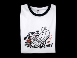
T-shirt — Jo LlCool, printed by Phénüm
website pictures — Gregg Bréhin
Risography print — Ateliers Bonus
Print — Grand Royal Studio
Typographies — Roboto by Christian Robertson and Van Dijk by Jan Van Dijk


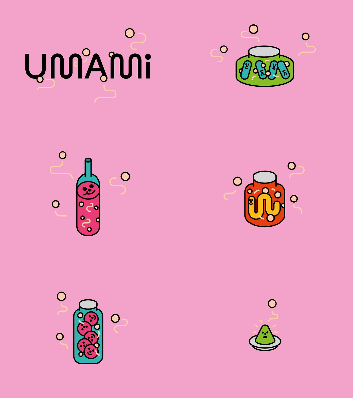
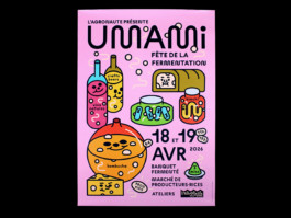
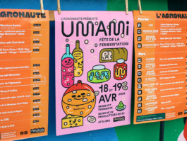
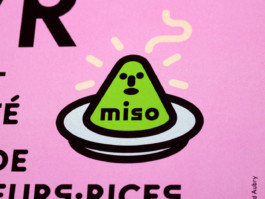
Visual identity for the 2026 edition of Umami, L’Agronaute’s fermentation festival. Aimed at both knowledgeable and family audiences, the communication seeks to represent the diversity of products showcased throughout the event.
Typography — Maxi Round by Dinamo


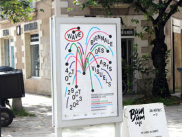
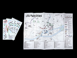
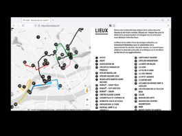
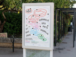
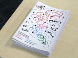
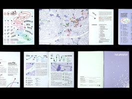
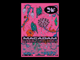
Visual identity, poster, leaflet and website for the 2023 and 2025 editions of Wave, the biennial of visual arts in Nantes and its metropolitan area. Every two years, the event brings together around sixty cultural organizations for a month of exhibitions across Nantes and the surrounding area.
Site internet — biennalewave.fr
Code — Guillaume Mazauric
Photography — Antoine Denoual
Print — Cloître Imprimeurs
Typography — GT Pressura by Grilli Type


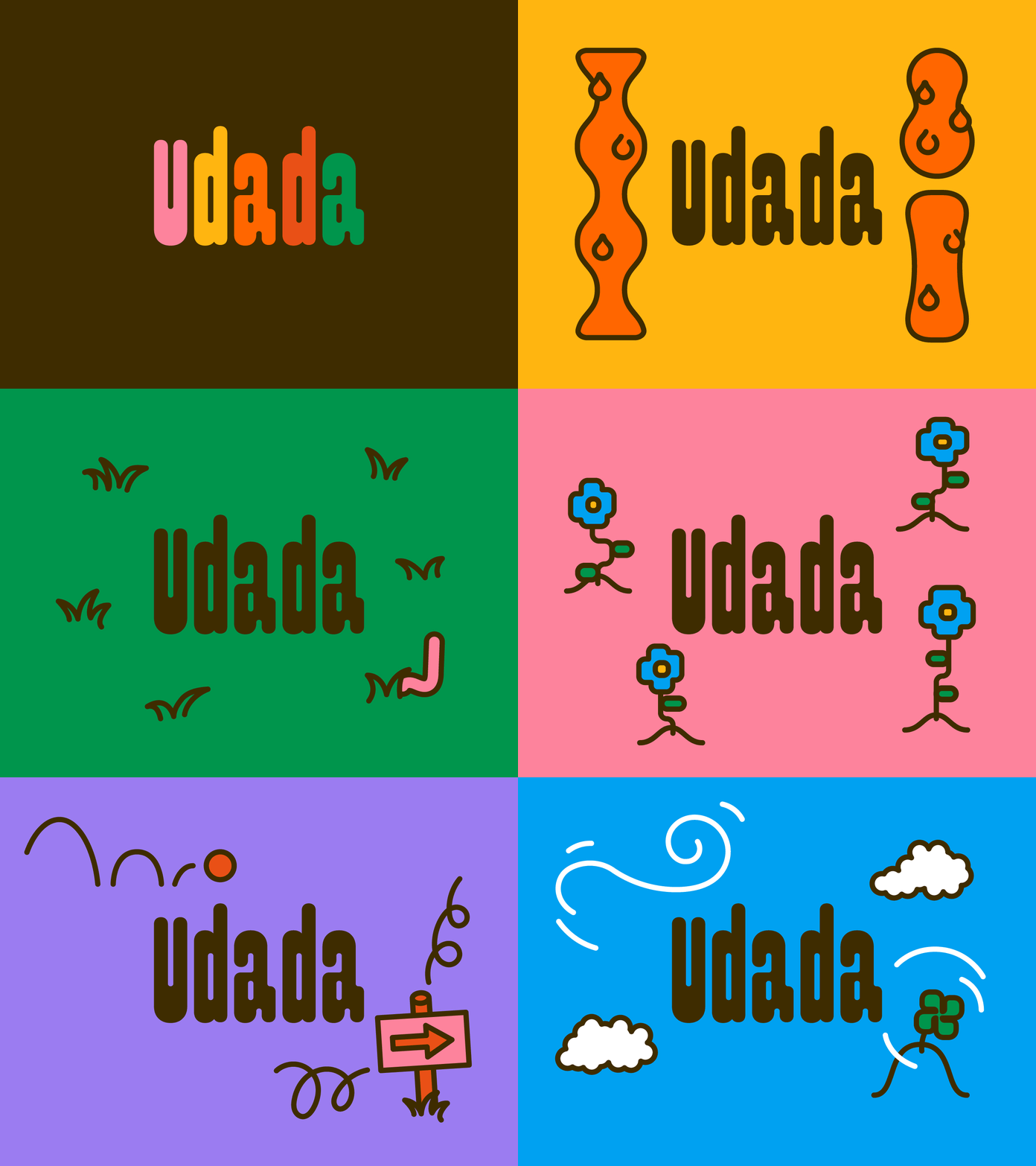
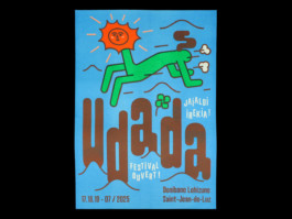
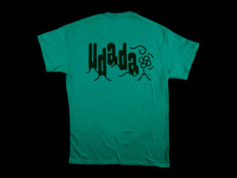
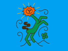
Visual identity for the Udada music festival in Saint-Jean-de-Luz. As the name of the festival means “it’s summer” in Basque, a sunny mascot announces the beginning of the summer season in a burst of color.
Typographies— Pimpit by Benoit Bodhuin and Caramel by Adrien Vasquez
Risography print — Quintal


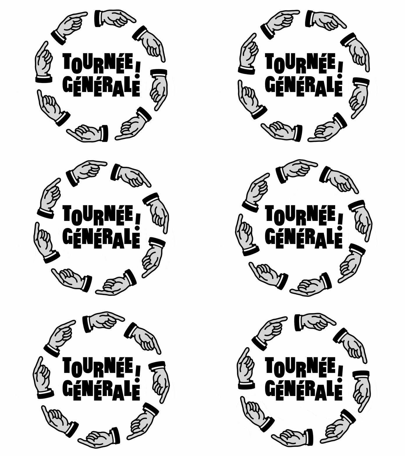
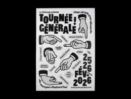
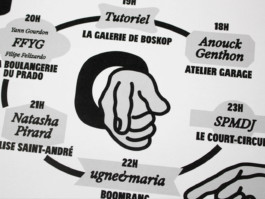
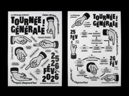
Poster and programme for the touring experimental music festival organized by Le Périscope in Lyon. The event is unique in that each concert takes place in a different bar.
Typographies — Exposure by 205tf and Buzz Black by Quentin Coul


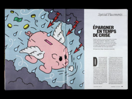
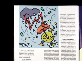
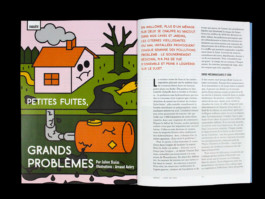
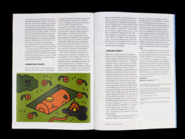
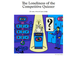
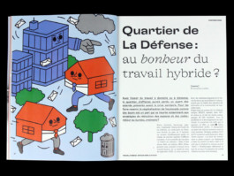
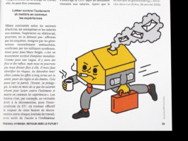
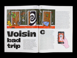
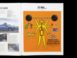
Illustrations for national and international press.


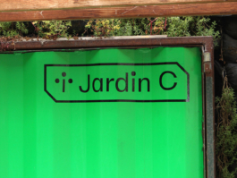
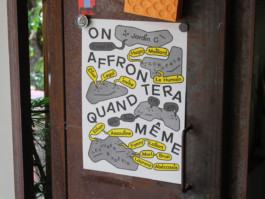
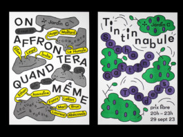
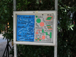
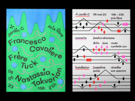
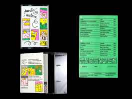
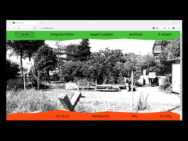
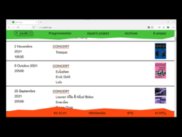
Visual identity and website for Jardin C, an outdoor place in Nantes dedicated to experimental culture. As the garden is an outside venue, every event organized there is very sensitive to the weather. The website has indicators for current time, temperature and humidity.
Website — jardinc.org
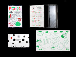
Illustrations cassette — Jaune Jone
Risography print — Ateliers Bonus
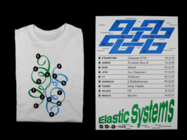
Typography — Elastik by Benoît Bodhuin


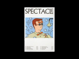
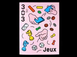
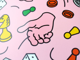
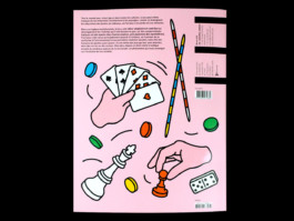
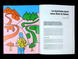
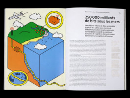
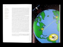
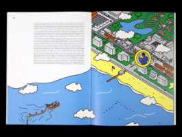
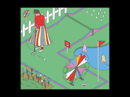
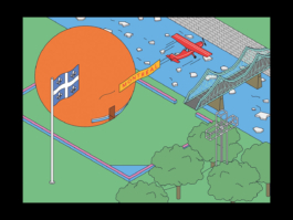
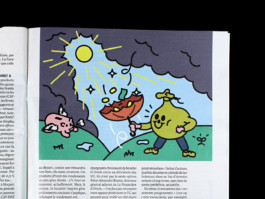
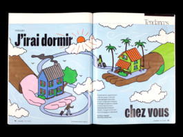
Illustrations for Revue 303, a magazine dedicated to the heritage and cultural diversity of the Pays de la Loire region. I created the cover for the issue dedicated to games, as well as an interior illustration about playful tourism. I also illustrated an article about a submarine telecommunications cable connecting France to the beaches of Virginia Beach in the United States for the “Flux” issue.
Direction Artistique — Carine Sellin
Typography — A23D Solid by A2 Type


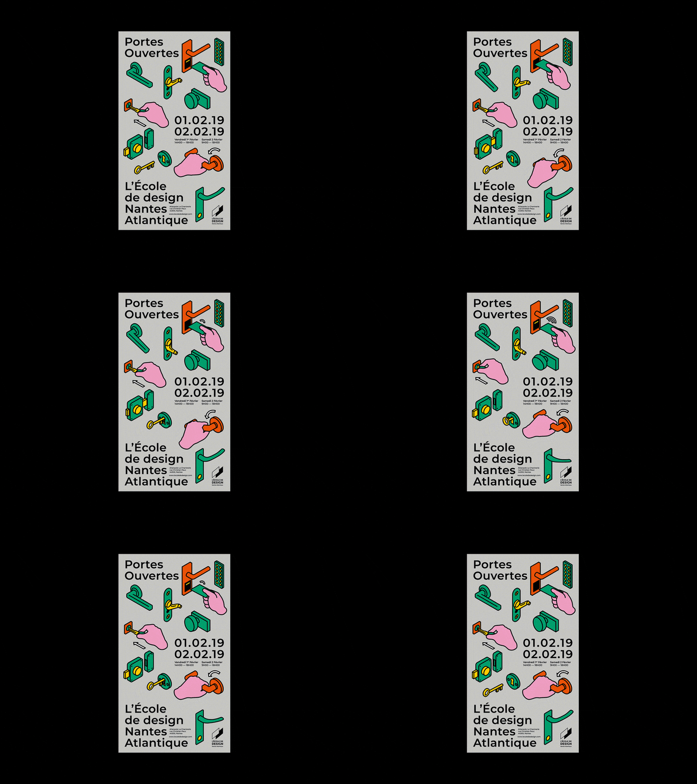
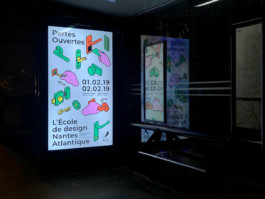
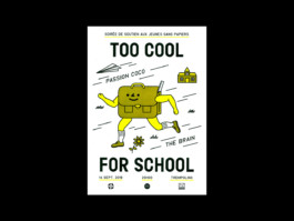
Poster for Open Day 2019 at L'École de Design Nantes Atlantique.


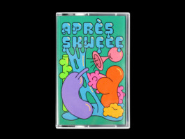
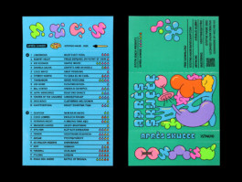
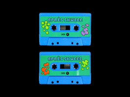
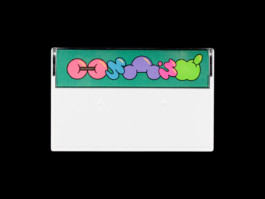
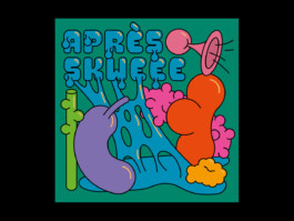
'Après Skweee' is a compilation released by polish label Istotne Nagr. dedicated to a micro-genre called 'Skweee', a slow tempo electronic music made of funky rythms and chiptune sounds that raised in the late 2000's in Sweden and Finland. This release is the proof that the genre is still active today in 2025.
Bandcamp — Istotne Nagr.
Typographies — Biff by Lineto and Zig Zag by Benoit Bodhuin


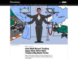
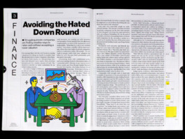
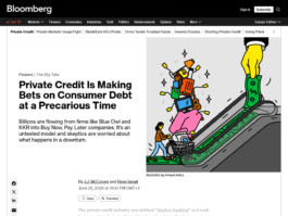
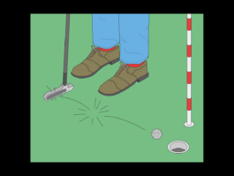
Illustrations for economy magazine Bloomberg Businessweek.
Artistic Direction — Jordi NG, Chandra Illick


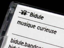
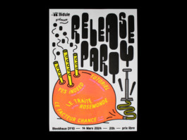
Visual identity for Bidule, a record label dedicated to curious and unconventional music. The label’s visual identity adapts to the aesthetics of each musical project, using the dot as a graphic motif.
Bidule — Linktree
Risography print — Ateliers Bonus
Screenprint t-shirt — Atelier du Grand Chic


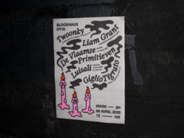
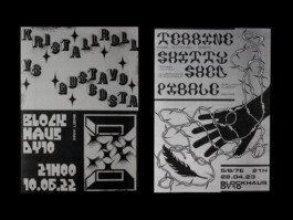
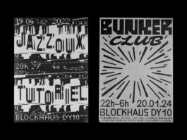
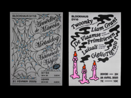
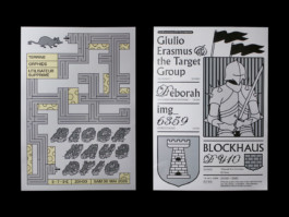
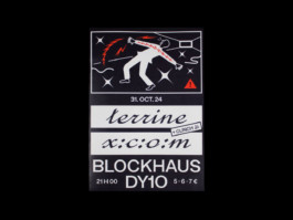
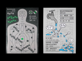
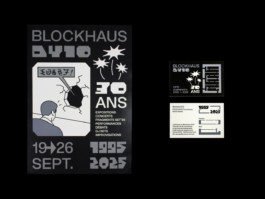
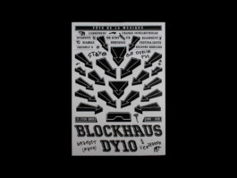
Posters for Blockhaus DY10, a self-managed experimental art space in Nantes, located in a World War II bunker. With a focus on constant renewal, the posters share no recurring graphic elements, except for the use of grey.


Micro editions of illustrations printed in giclée, screenprint and risography. Don't hesitate to take order.


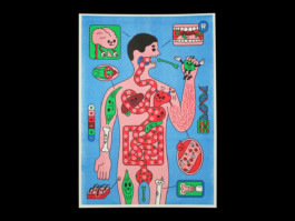
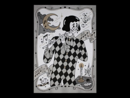
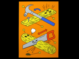
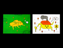
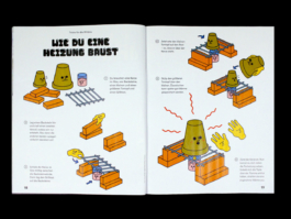
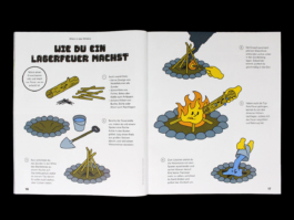
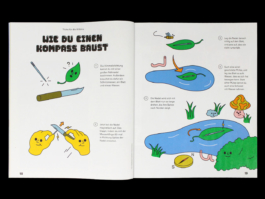
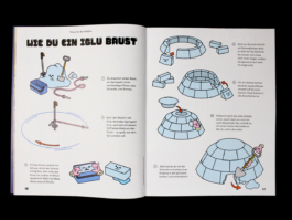
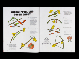
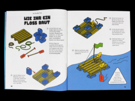
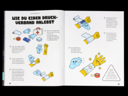
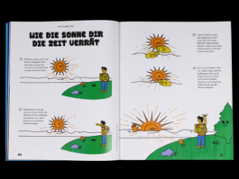
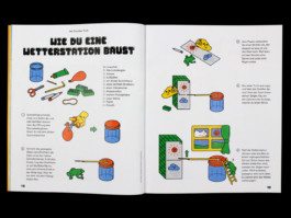
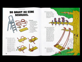
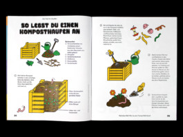
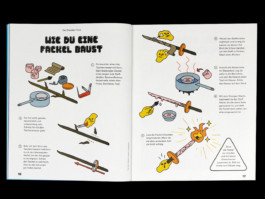
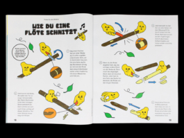
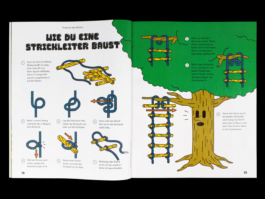
Zeit Leo magazine offer to their young readers instructions to live in wilderness ! On the menu : carve a flute, build a a rope ladder, build a shelter, make a fire, build a compass, make a clay pot heater and build an igloo !
Artistic Direction — Kaï Schmitzer


Selection of visuals and identities.


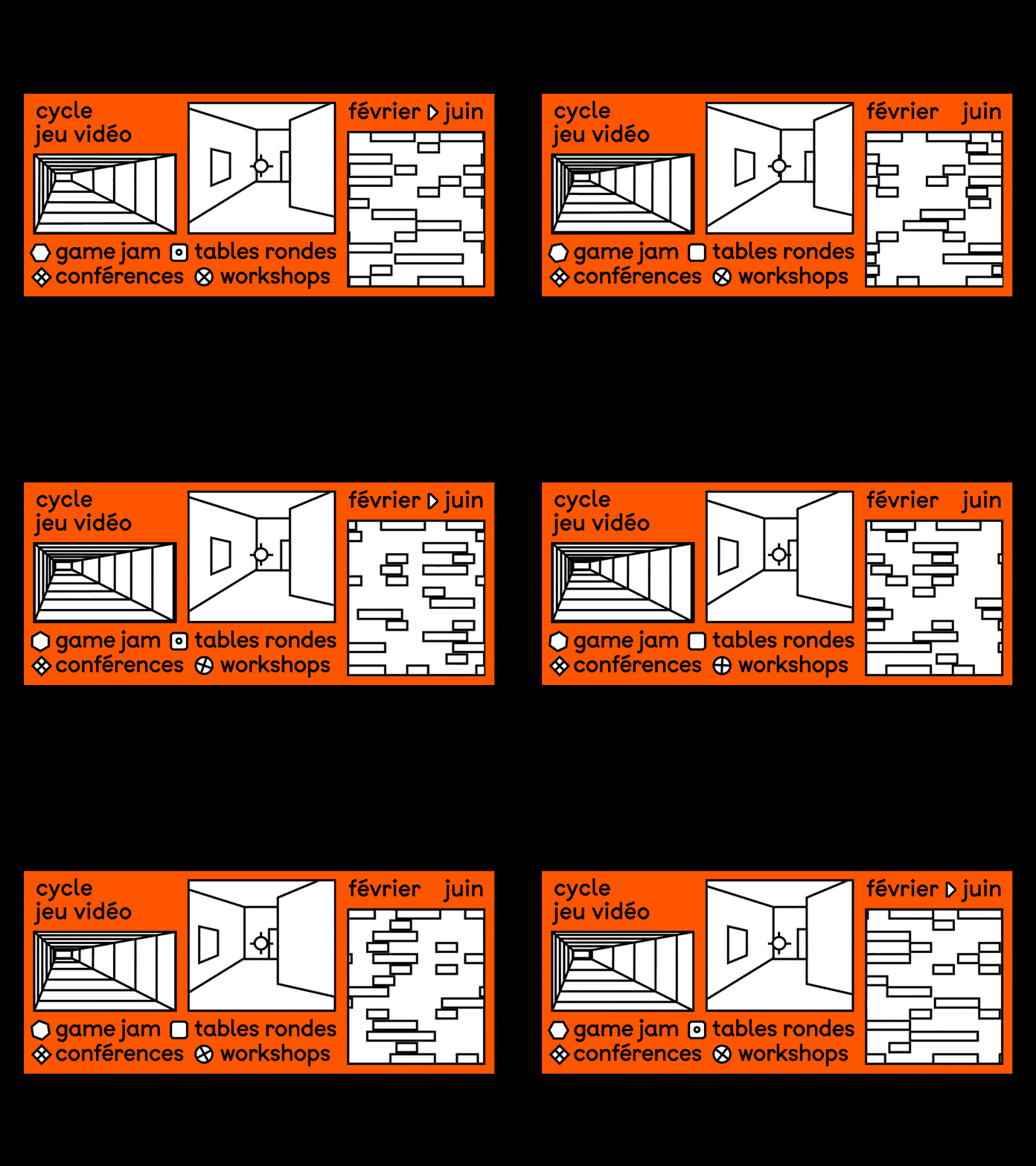
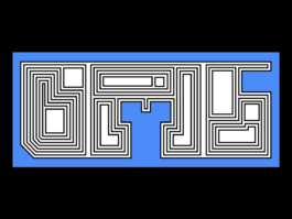
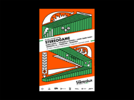
Visual identity for a succession of events about video games. Inspired by Op art, I created a serie of abstract images that let anyone relate it to their own experience of video game.
Typography — BTP by A is for fonts


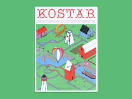
Illustrations and titles for the issue 54 of the local magazine Kostar.
Artistic Direction — Damien Chauveau
Typography — Brevier Viennese by Languste Fonts


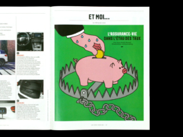
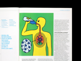
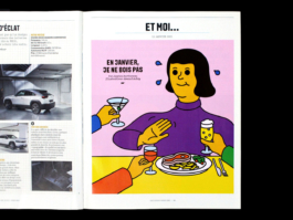
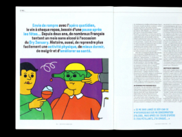
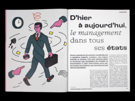
Illustrations for lifestyle and economy magazine Les Échos week-end.
Artistic Direction — Alice Lagarde


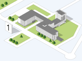
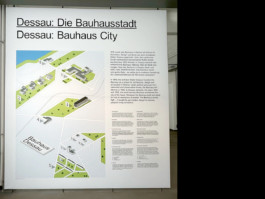
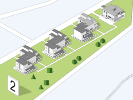
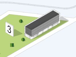
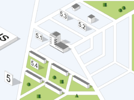
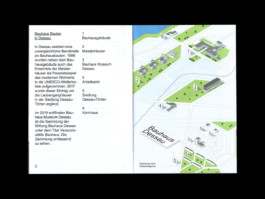
Illustrated map for Bauhaus representing the buildings linked to the school in the city of Dessau. Each of the constructions had to be recognizable at one sight, respecting its geographical position in the city.
Artistic Direction — Herburg Weiland
Typography — Arial


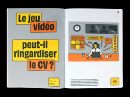
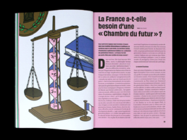
Illustrations for the magazine Usbek & Rica.
Artistic Direction — Alice Jauneau


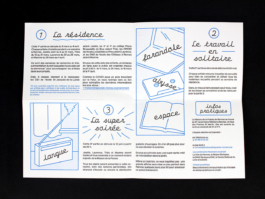
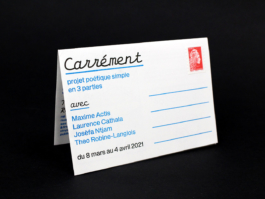
Visual identity for Carrément, a cycle of artist residence at poetry house in Rennes. The identity is based on the use of image words, in the style of Magritte, to illustrate the process of each artist during the residence.
Risography print — Club Couleurs
Typographies — Olympe Mono by A is for fonts and Trainer Grotesk d'Antoine Elsensohn


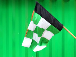
Illustrative visual identity for the Prairie au Duc neighborhood festival in Nantes, based on a construction site theme, bringing together the neighborhood’s various cultural and community organizations and venues.
Typography — Baste A by Lift Type and Apfel Grotezk by Collletttivo
Screenprint — Élise Hallab


Askip is an art gallery, café, and laundromat located within the Nantes School of Fine Arts. The identity and website is built around Van Dijk, a distinctive typeface that reflects the spontaneity and informal spirit of a community-run café.
website — askipaskipaskip.com
T-shirt — Jo LlCool, printed by Phénüm
website pictures — Gregg Bréhin
Risography print — Ateliers Bonus
Print — Grand Royal Studio
Typographies — Roboto by Christian Robertson and Van Dijk by Jan Van Dijk


Visual identity for the 2026 edition of Umami, L’Agronaute’s fermentation festival. Aimed at both knowledgeable and family audiences, the communication seeks to represent the diversity of products showcased throughout the event.
Typography — Maxi Round by Dinamo


Visual identity, poster, leaflet and website for the 2023 and 2025 editions of Wave, the biennial of visual arts in Nantes and its metropolitan area. Every two years, the event brings together around sixty cultural organizations for a month of exhibitions across Nantes and the surrounding area.
Site internet — biennalewave.fr
Code — Guillaume Mazauric
Photography — Antoine Denoual
Print — Cloître Imprimeurs
Typography — GT Pressura by Grilli Type


Visual identity for the Udada music festival in Saint-Jean-de-Luz. As the name of the festival means “it’s summer” in Basque, a sunny mascot announces the beginning of the summer season in a burst of color.
Typographies— Pimpit by Benoit Bodhuin and Caramel by Adrien Vasquez
Risography print — Quintal


Poster and programme for the touring experimental music festival organized by Le Périscope in Lyon. The event is unique in that each concert takes place in a different bar.
Typographies — Exposure by 205tf and Buzz Black by Quentin Coul


Illustrations for national and international press.


Visual identity and website for Jardin C, an outdoor place in Nantes dedicated to experimental culture. As the garden is an outside venue, every event organized there is very sensitive to the weather. The website has indicators for current time, temperature and humidity.
Website — jardinc.org
Illustrations cassette — Jaune Jone
Risography print — Ateliers Bonus
Typography — Elastik by Benoît Bodhuin


Illustrations for Revue 303, a magazine dedicated to the heritage and cultural diversity of the Pays de la Loire region. I created the cover for the issue dedicated to games, as well as an interior illustration about playful tourism. I also illustrated an article about a submarine telecommunications cable connecting France to the beaches of Virginia Beach in the United States for the “Flux” issue.
Direction Artistique — Carine Sellin
Typography — A23D Solid by A2 Type


Poster for Open Day 2019 at L'École de Design Nantes Atlantique.


'Après Skweee' is a compilation released by polish label Istotne Nagr. dedicated to a micro-genre called 'Skweee', a slow tempo electronic music made of funky rythms and chiptune sounds that raised in the late 2000's in Sweden and Finland. This release is the proof that the genre is still active today in 2025.
Bandcamp — Istotne Nagr.
Typographies — Biff by Lineto and Zig Zag by Benoit Bodhuin


Illustrations for economy magazine Bloomberg Businessweek.
Artistic Direction — Jordi NG, Chandra Illick


Visual identity for Bidule, a record label dedicated to curious and unconventional music. The label’s visual identity adapts to the aesthetics of each musical project, using the dot as a graphic motif.
Bidule — Linktree
Risography print — Ateliers Bonus
Screenprint t-shirt — Atelier du Grand Chic


Posters for Blockhaus DY10, a self-managed experimental art space in Nantes, located in a World War II bunker. With a focus on constant renewal, the posters share no recurring graphic elements, except for the use of grey.


Micro editions of illustrations printed in giclée, screenprint and risography. Don't hesitate to take order.


Zeit Leo magazine offer to their young readers instructions to live in wilderness ! On the menu : carve a flute, build a a rope ladder, build a shelter, make a fire, build a compass, make a clay pot heater and build an igloo !
Artistic Direction — Kaï Schmitzer


Selection of visuals and identities.


Visual identity for a succession of events about video games. Inspired by Op art, I created a serie of abstract images that let anyone relate it to their own experience of video game.
Typography — BTP by A is for fonts


Illustrations and titles for the issue 54 of the local magazine Kostar.
Artistic Direction — Damien Chauveau
Typography — Brevier Viennese by Languste Fonts


Illustrations for lifestyle and economy magazine Les Échos week-end.
Artistic Direction — Alice Lagarde


Illustrated map for Bauhaus representing the buildings linked to the school in the city of Dessau. Each of the constructions had to be recognizable at one sight, respecting its geographical position in the city.
Artistic Direction — Herburg Weiland
Typography — Arial


Illustrations for the magazine Usbek & Rica.
Artistic Direction — Alice Jauneau


Visual identity for Carrément, a cycle of artist residence at poetry house in Rennes. The identity is based on the use of image words, in the style of Magritte, to illustrate the process of each artist during the residence.
Risography print — Club Couleurs
Typographies — Olympe Mono by A is for fonts and Trainer Grotesk d'Antoine Elsensohn
© 2016 - 2026 — Arnaud Aubry
↑ top the top
© 2016 - 2026 —
Arnaud Aubry
↑ top the top